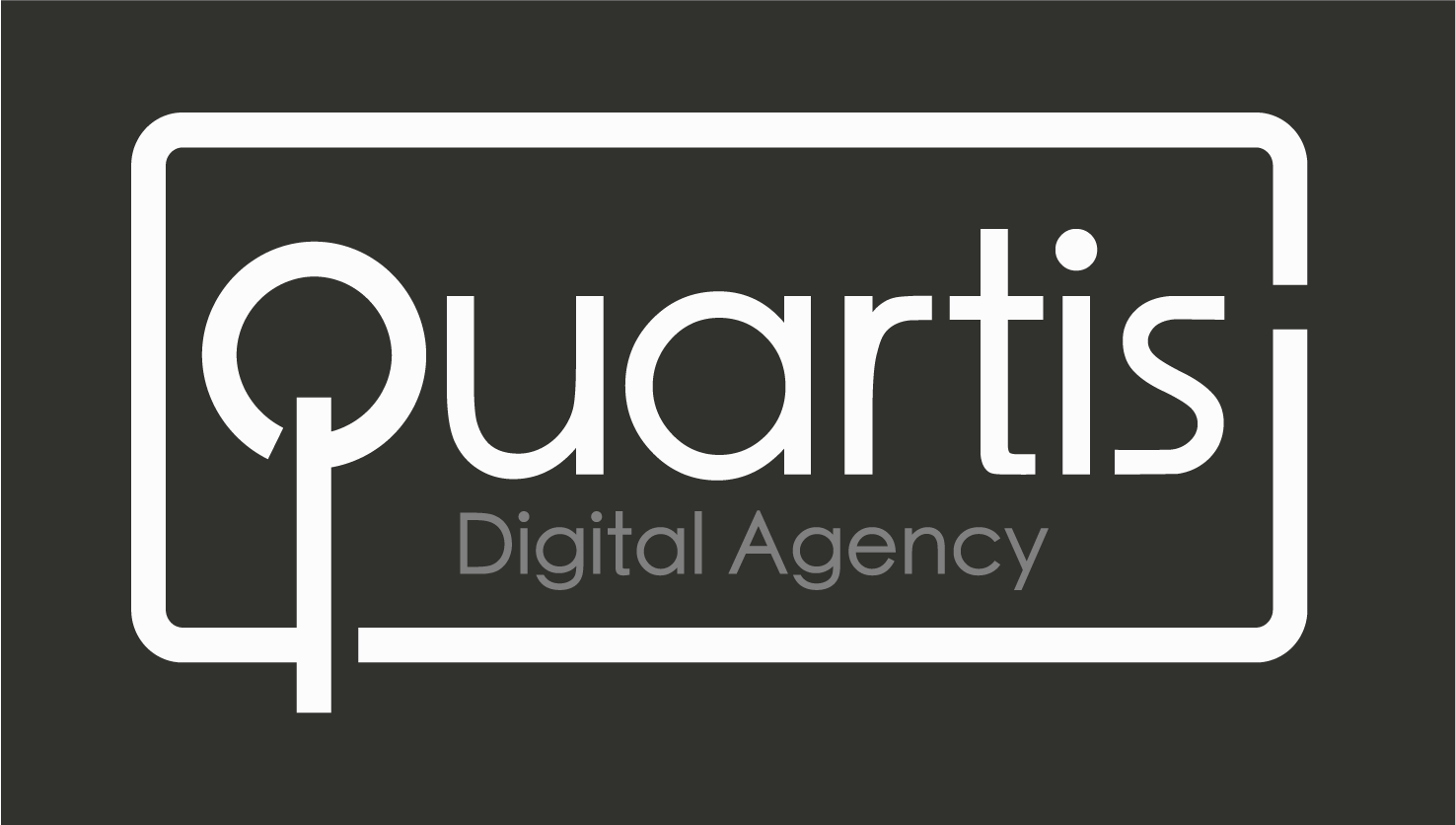
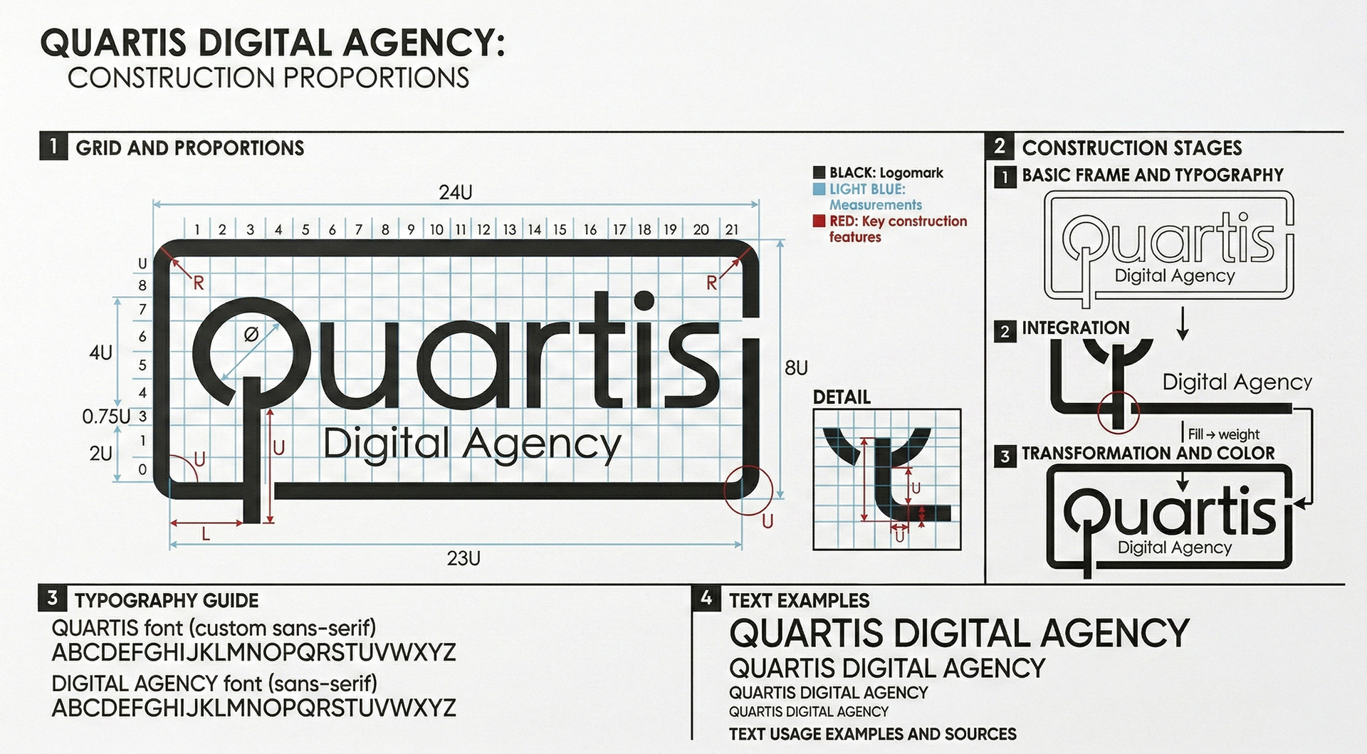
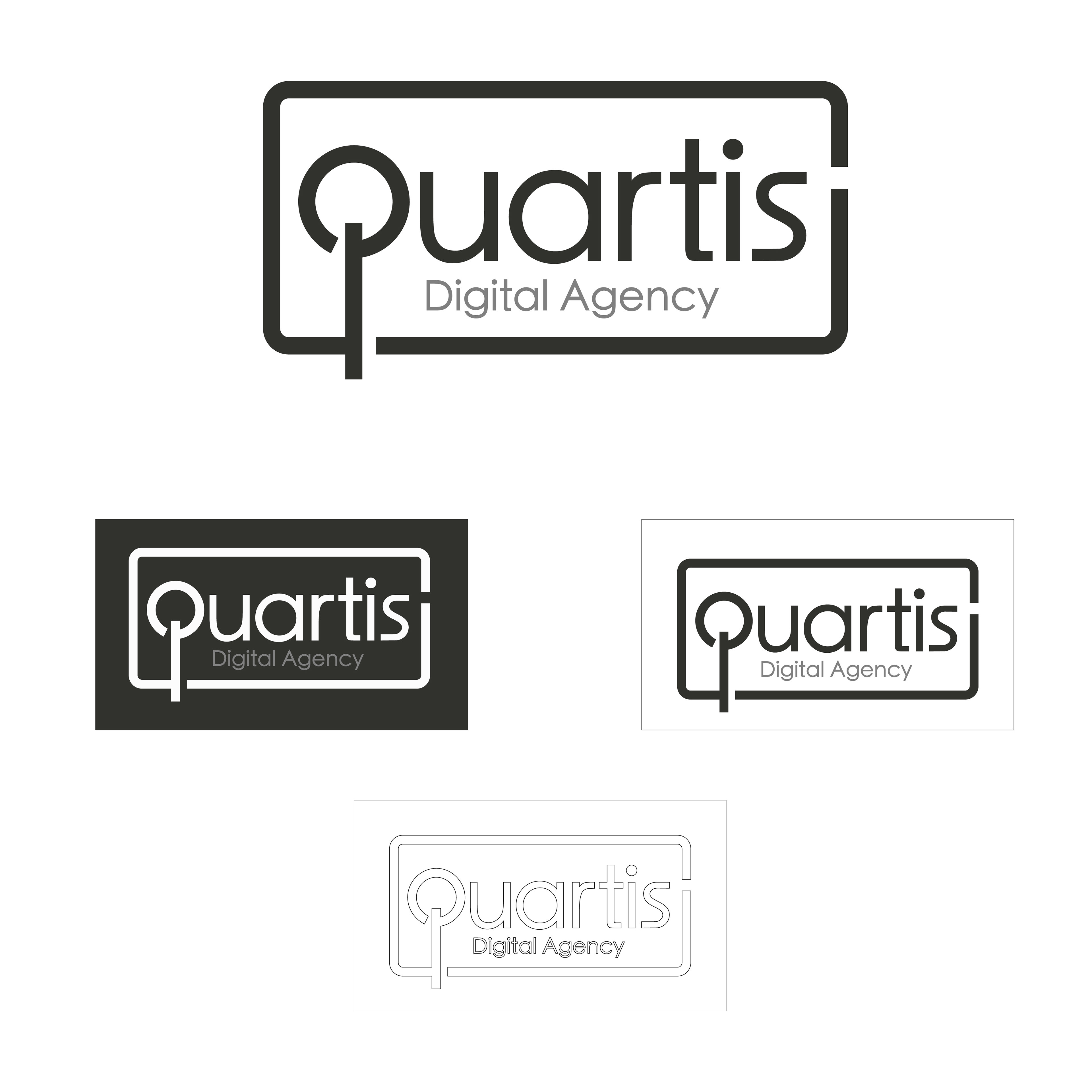
This typography-focused logo, designed for the digital agency Quartis, centers around the concept of 'thinking outside the frame'. A clean, modern sans-serif font was chosen, and the logo's boundaries were stretched using the extensions of the letters 'Q' and 'S'. A minimalist aesthetic was adopted to ensure seamless integration into both negative and positive spaces (black on white, white on black) and even just the outline. This created a strong brand identity that easily adapts to all types of digital and print materials.
Think Outside
of the Frame